CarbonSustain
Simplifying carbon reporting for businesses to empower sustainable corporate decisions.

www.carbonsustain.io
overview
Context.
Carbon Sustain is an AI-powered startup platform helping SMBs track, reduce, and benefit financially from their carbon emissions management. During my internship, I tackled multiple high-impact projects such as designing the landing page, simplifying the AI Insights dashboard, and redesigning a CDP (Carbon Disclosure Project) reporting form.
ROLE
Product Design & Development Intern
TIMELINE
May 2024 - Aug 2024
SKILLS
UI Design, Frontend Development, Prototyping, Interaction Design
TEAM
2 Designers, 1 Full-Stack Developer
Defining the problem space.
The CDP Report is a comprehensive environmental impact assessment that spans 150+ segments across 100+ pages. While Carbon Sustain offers this reporting tool for its clients to fill out and receive a downloadable PDF report, the existing interface creates a time-consuming process for business professionals. Users, such as Chief Sustainability Officers and Environmental Compliance Managers, rely on this reporting tool to turn their complex carbon metrics into actionable sustainability insights for their companies. My role focused on improving two main user experiences:
📍
Simplifying Navigation
Creating an intuitive structure that allows users to move effortlessly between different report sections. Minimizing click fatigue and unnecessary interactions.
📍
Enhancing Content Visibility
Redesigning the question layout to improve scannability and give users better context for their responses.
design process
Identifying pain points in the existing CDP Report design.
The existing CDP Report form implemented on Carbon Sustain’s platform suffered significant navigation demands. Users had to click through over 100+ individual screens to finish the questionnaire, with each question and its subquestions isolated on separate pages. This fragmented design made it difficult for users to locate specific questions and review their previous responses.
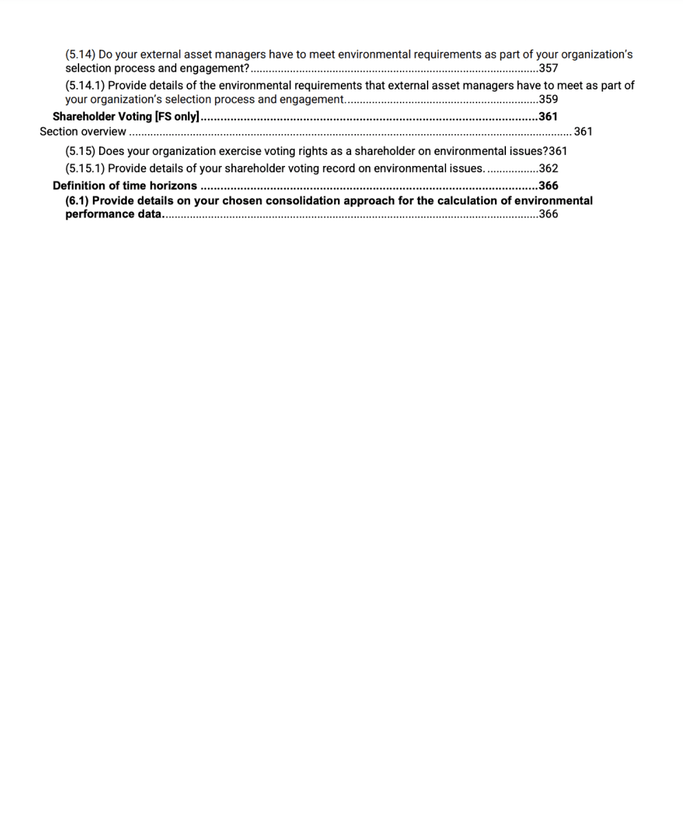
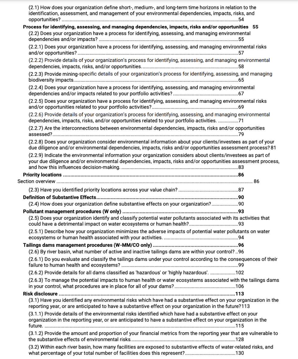
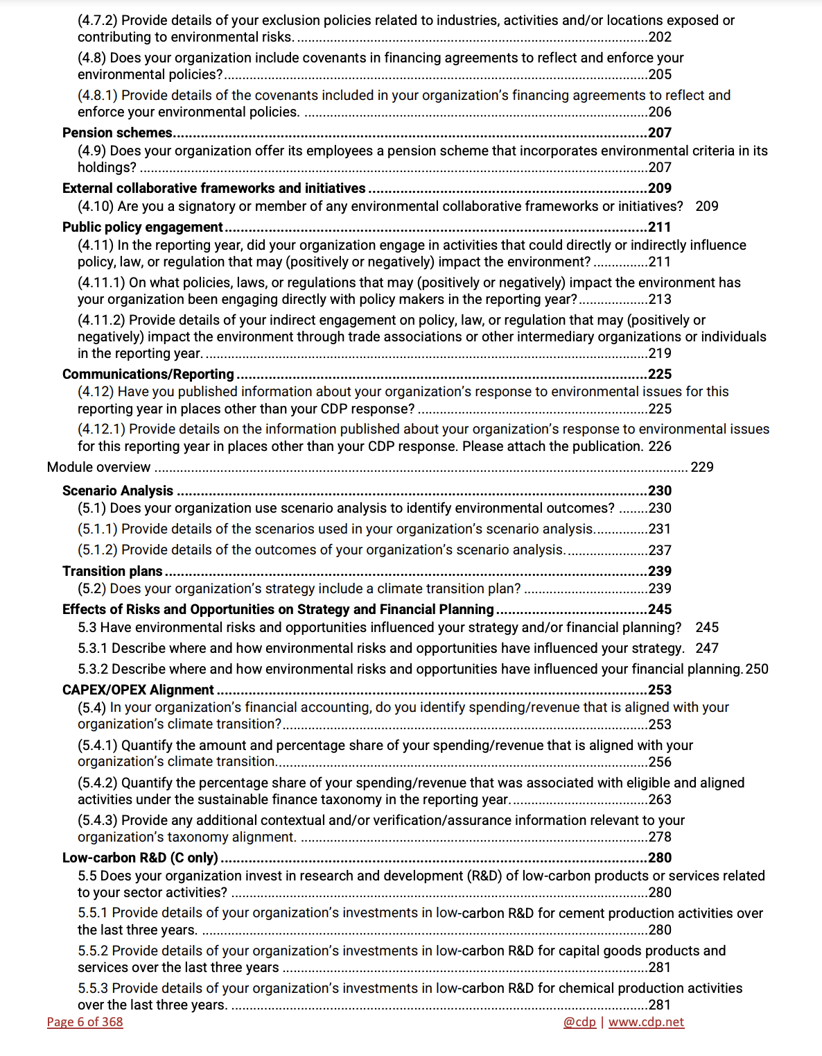
CDP Report
The questionnaire spans 150+ segments across 100+ pages (taken from the Official CDP Website).

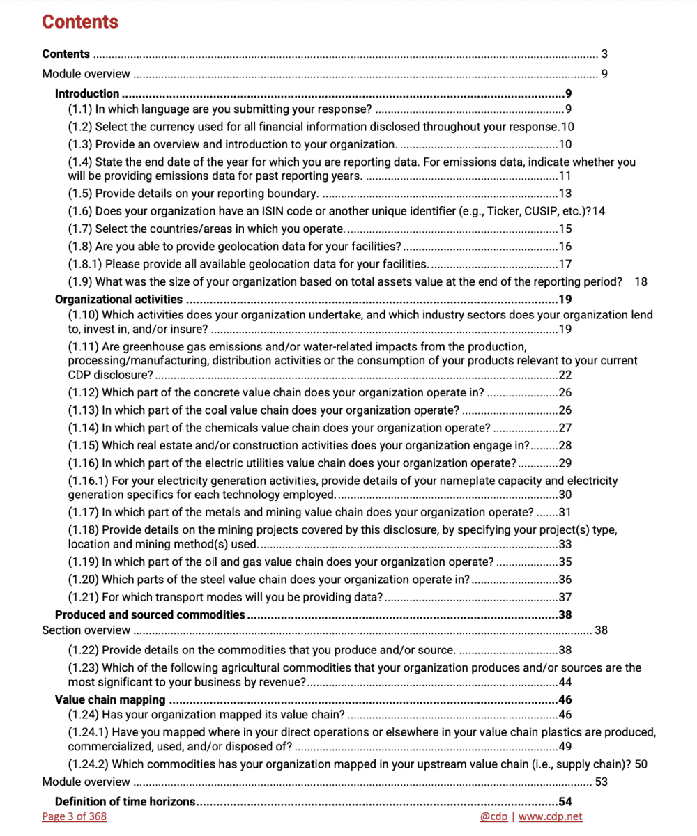

Current Design
The shortest question takes 6 screens alone to answer.


Engaging with stakeholders and clients to inform my process.
Discussions around design direction with my client helped me to understand which features I needed to prioritize. The Carbon Sustain team had already done preliminary research such as user testing. Moreover, I was provided with visual inspiration from existing competitor platforms, specifically TurboTax. Based on their research, I focused on addressing three main issues:
💡
Navigation Fatigue
Since the CDP Report requires a longer timeframe to complete, users can lose focus while filling out the form. Having organized navigation tools can facilitate the user input efficiency.
💡
High Learning Curve
Complex tools make it difficult for users to understand the form, prolonging the time needed to complete it. Creating an intuitive interface would reduce the time spent figuring out how to use the form.
💡
Lack of Progress Tracking
Users would benefit from live updates and indicators to help track their progress. An automatic saving feature would reassure users that their progress is being managed and saved.
It was clear that business professionals needed a tool to simplify their carbon reporting process.
How might we restructure the questionnaire to improve user reporting efficiency and reduce friction?
Creating the user flow.
Before diving into the designs, I wanted to ensure that users had a seamless experience when navigating the CDP Report Module.
CDP Report Module User Flow
A user walks through the questionnaire with textboxes and dropdown menus, ultimately finishing with a generated PDF.
Dashboard
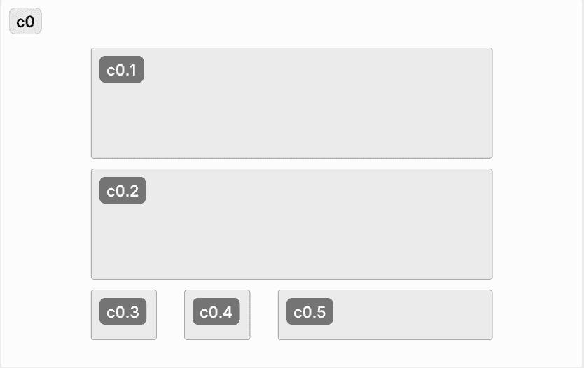
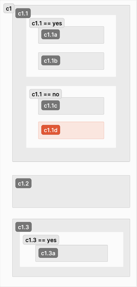
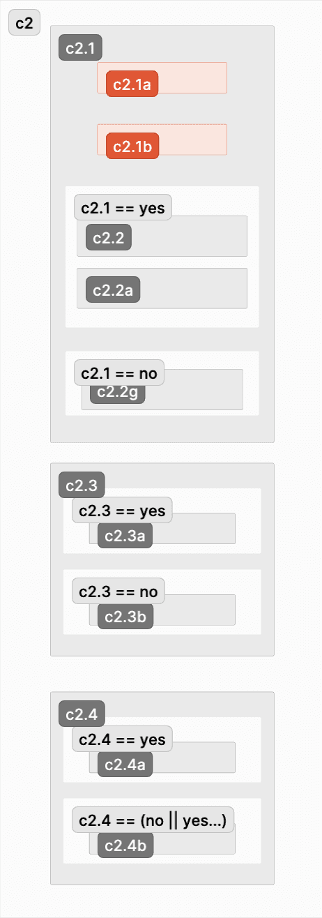
Outlining the structure of the form.
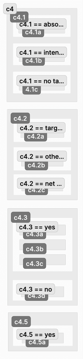
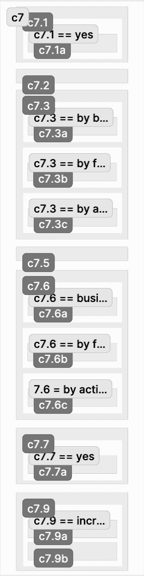
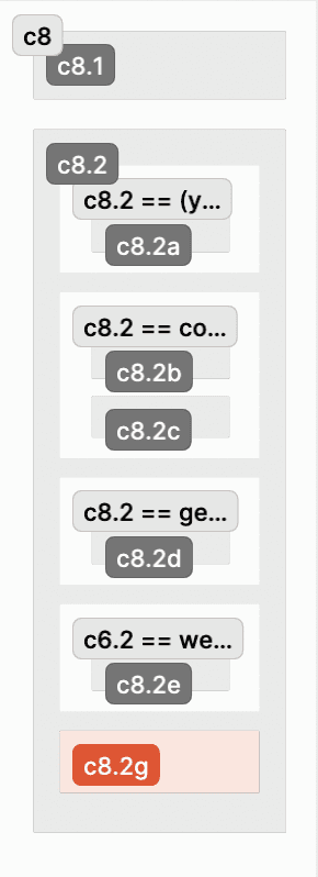
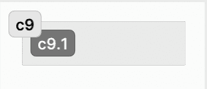
To condense the form from over 150 separate sections down to 16, I began by categorizing related questions. I created a comprehensive wireframe system in FigJam to visualize this organization, mapping out the questionnaire’s architecture and implementing conditional branching to dynamically display relevant questions based on user responses.
Wireframes
Categorizing questions into sections, ultimately condensing 150+ sections into 13 main sections; Each screen is one section.


Branching Logic
Conditional branching to dynamically display relevant questions based on user responses; Each screen is one section.


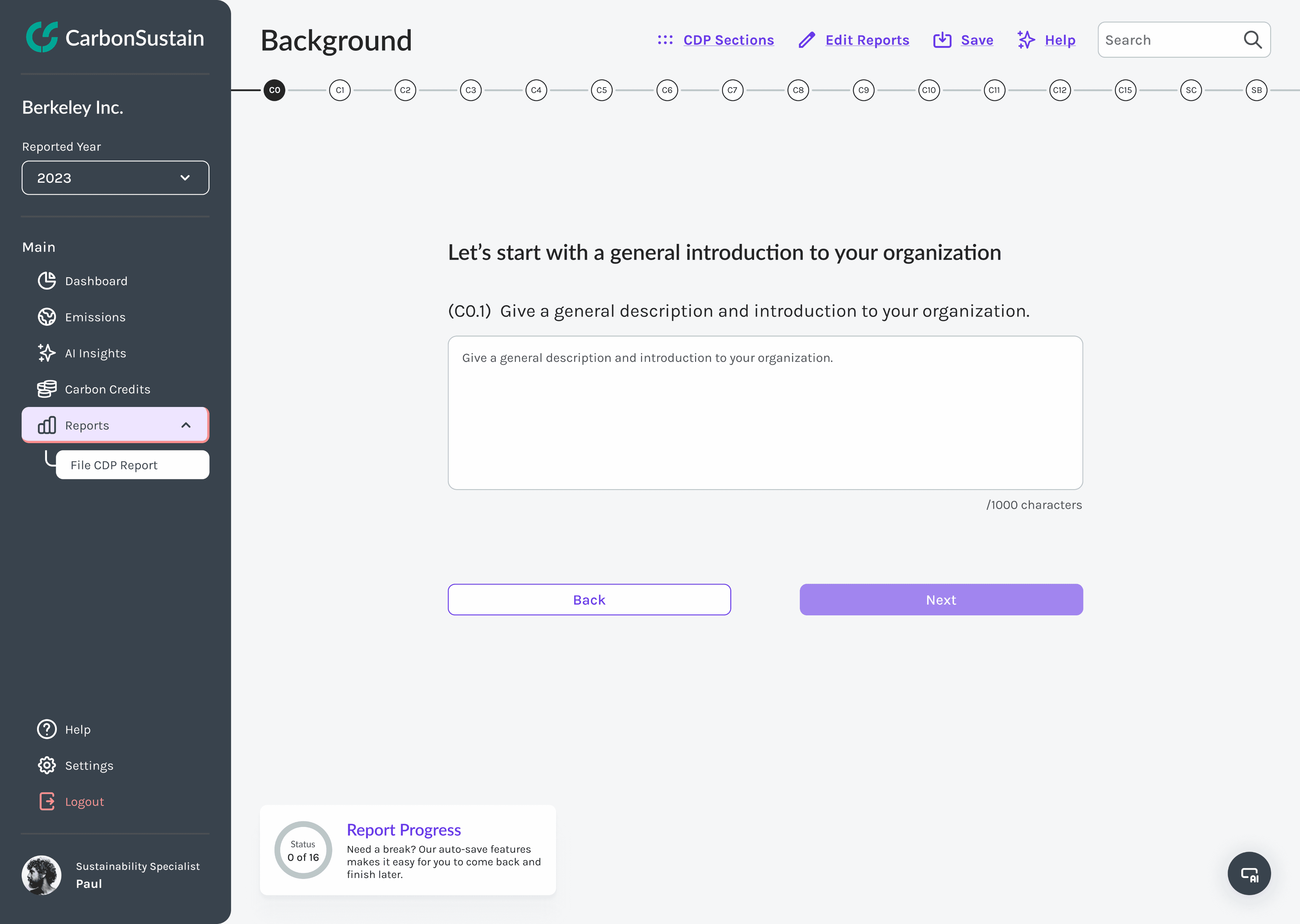
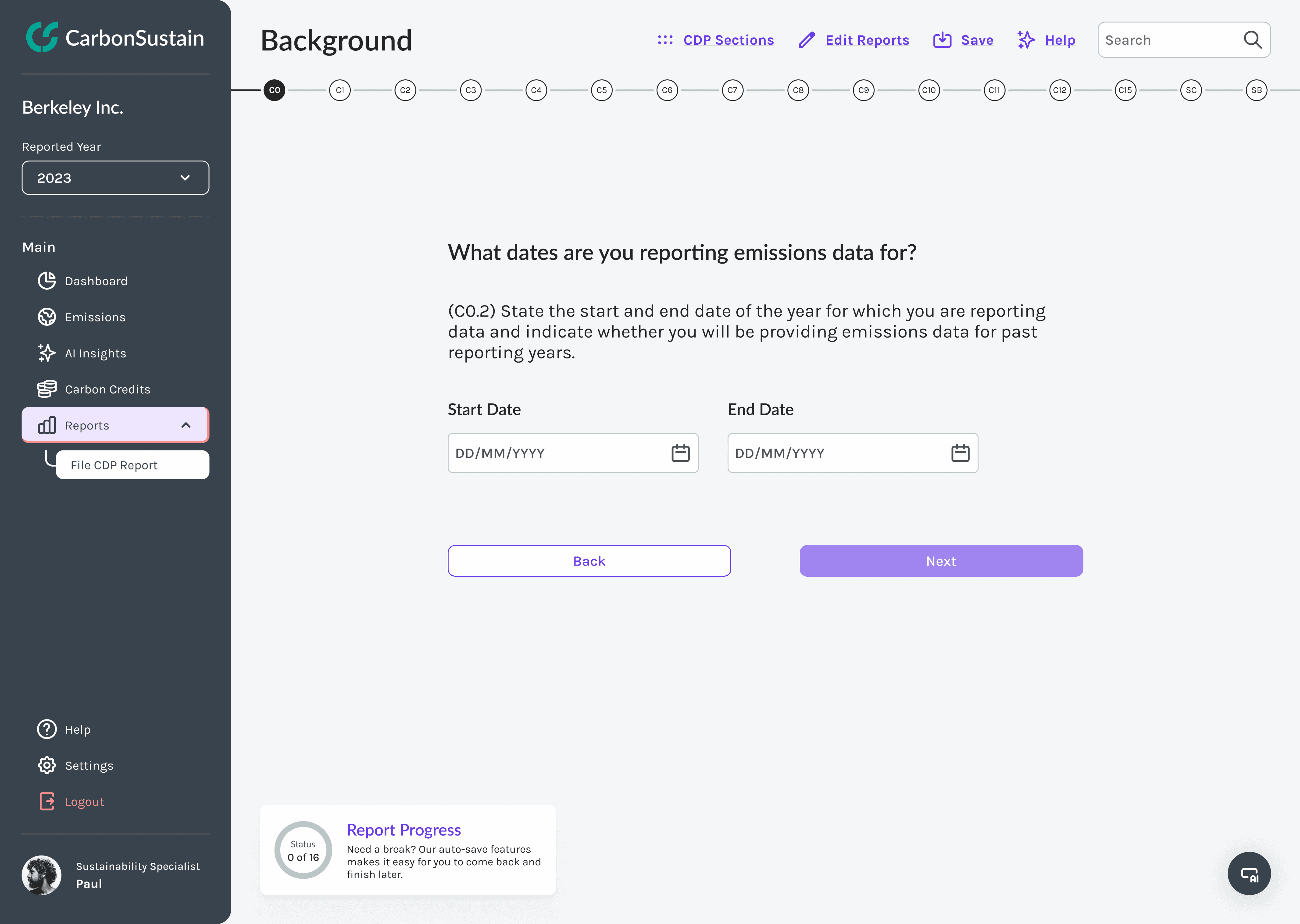
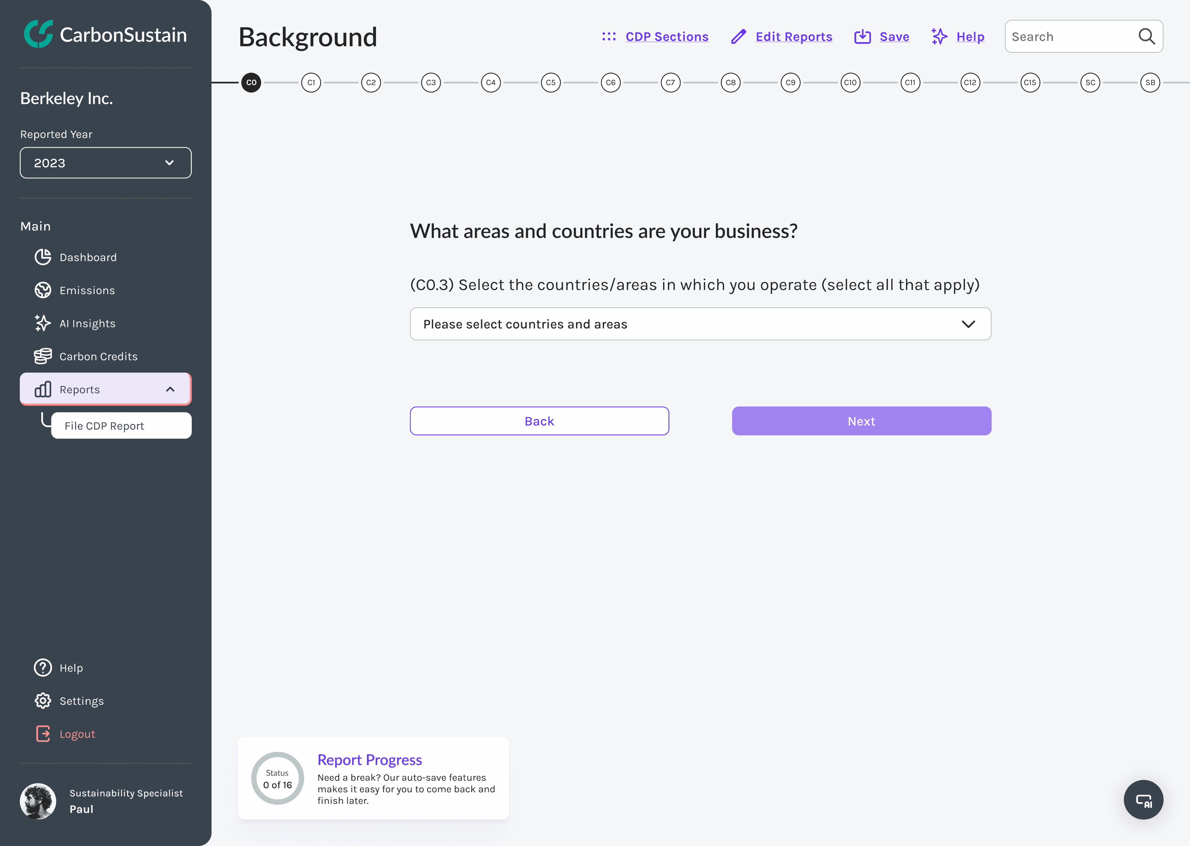
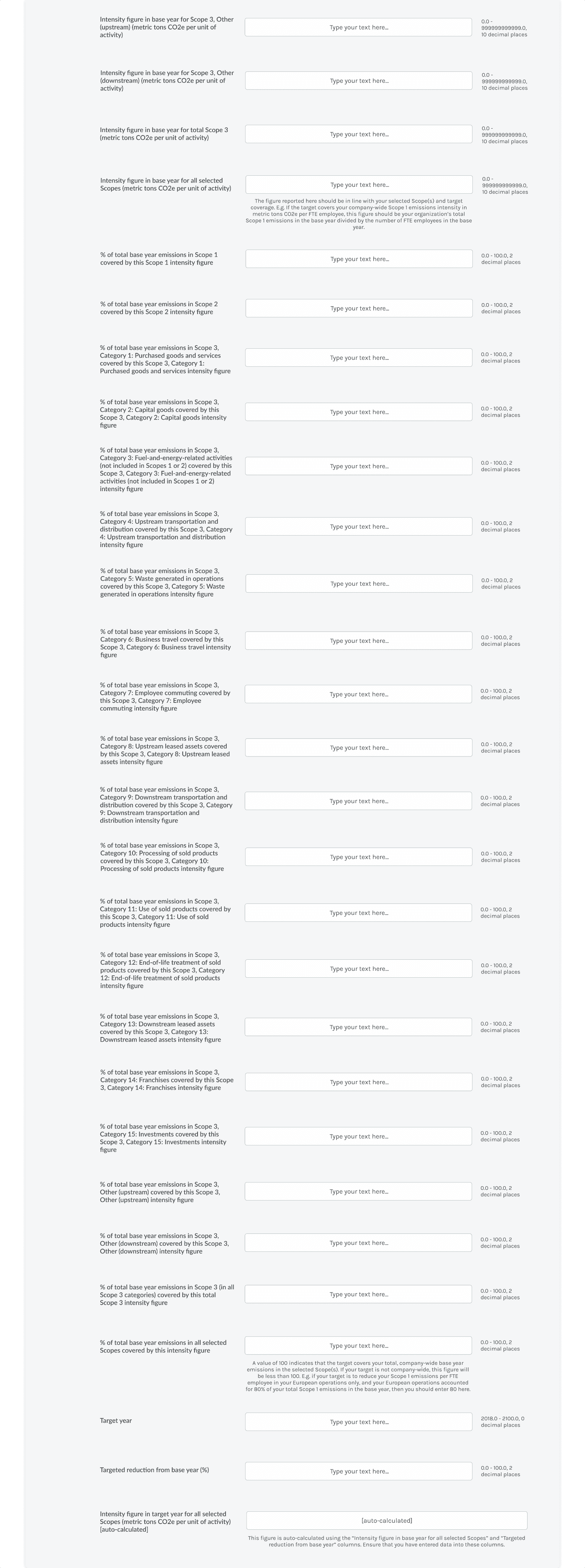
Breaking the page down into subsections.
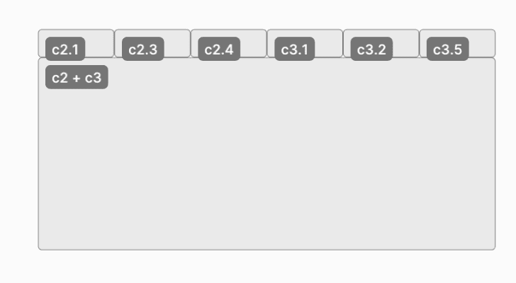
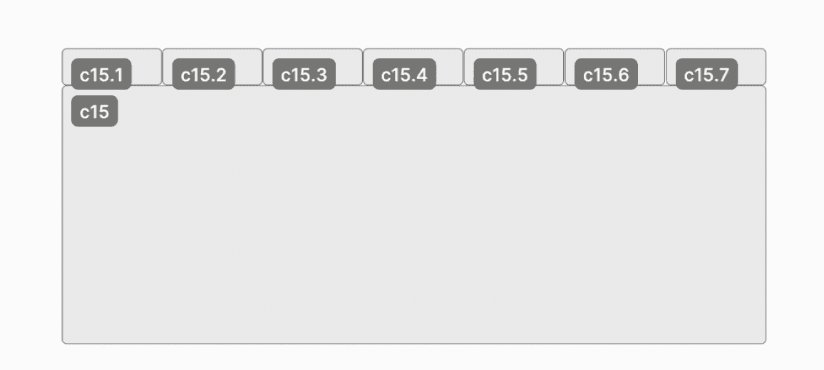
Each category contains around 5-10 main questions, with each question containing its own set of subquestions. To improve navigation, I mapped each question in the category to a tab. These tabs are displayed above the question content and directly beneath the overall progress tracking bar, allowing users to easily navigate to sections relevant to their reporting needs.
Final Version
An example page of the last question of the first section ‘Background and Governance’.
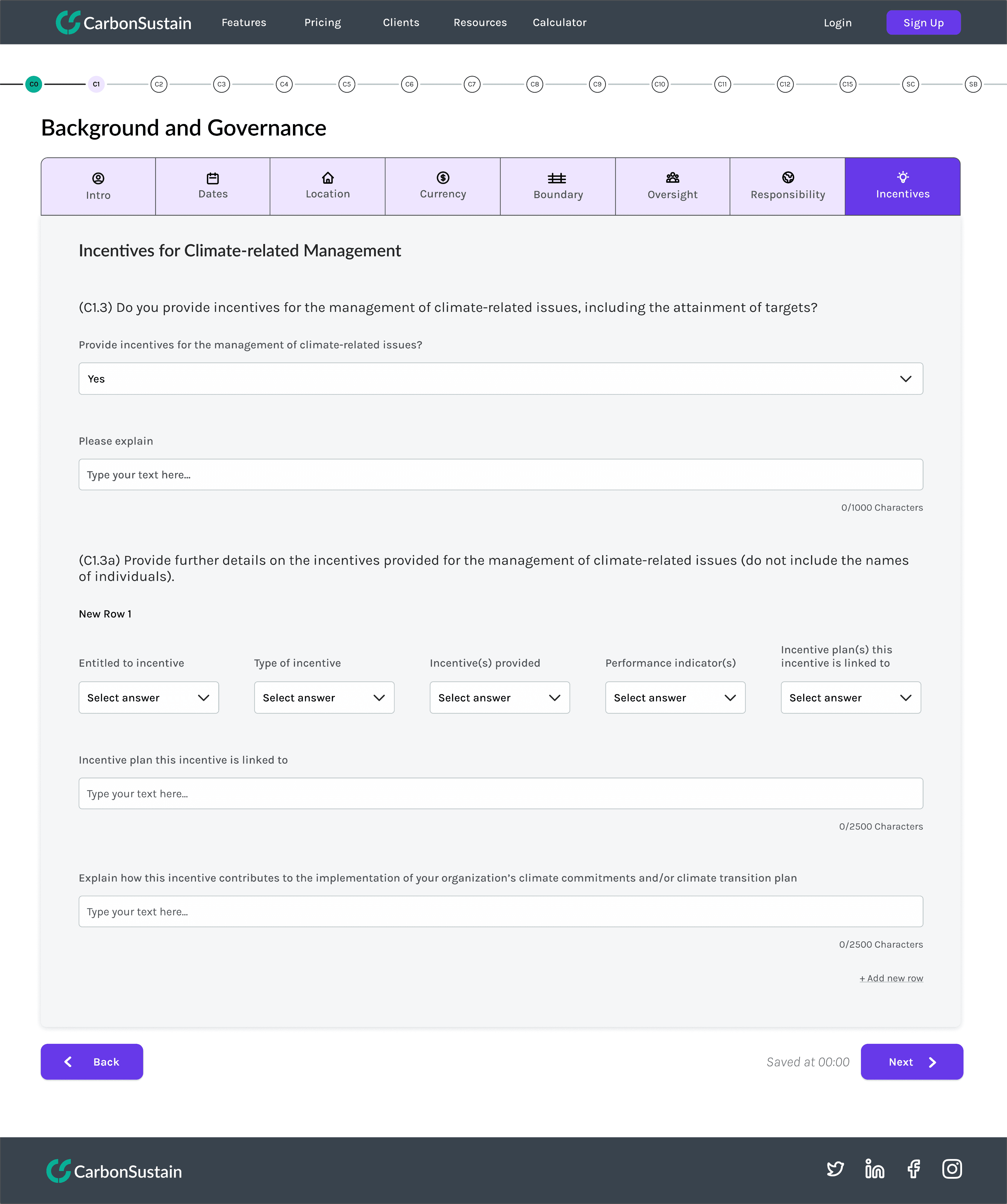
Progress tracking bar for categories
Tabs for questions of each category
Character count display for reference
Add row inline button
Auto save time feature
Category
Navigation buttons between sections
Summary title for the main question for clear visual hierarchy
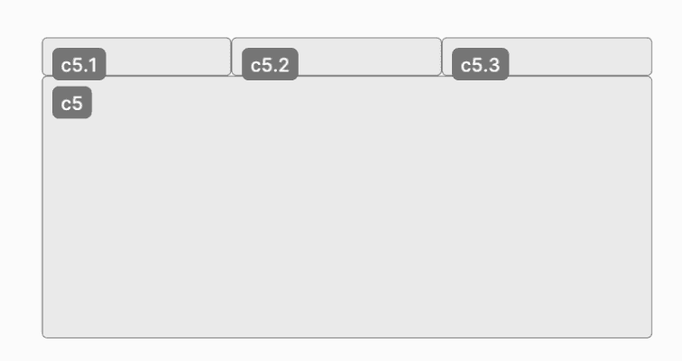
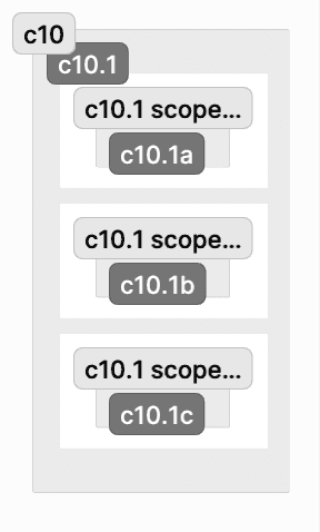
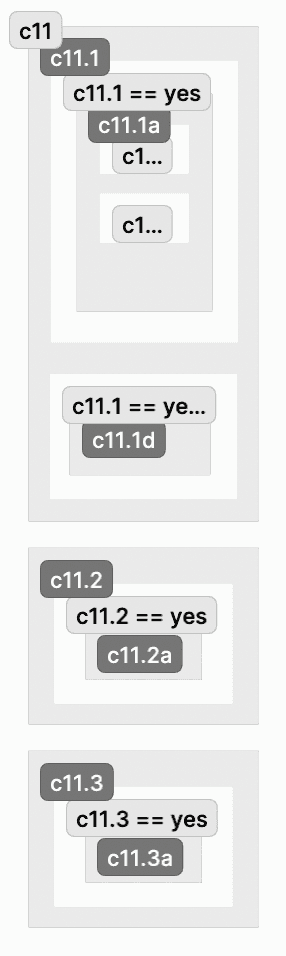
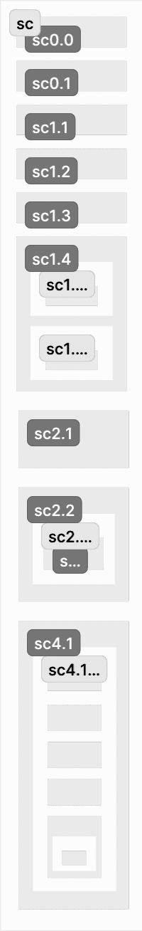
Condensing the form even further.
While consolidating the questions onto single pages improved navigation, it initially created visual overwhelm, particularly for questions containing over 100 input fields. My initial iteration stacked these input fields vertically, but this led to excessive scrolling and poor usability. To organize this, I organized the questions into a grid-like structure with rows and columns, and grouping them by scope emissions type (Scope 1, 2, 3, downstream, upstream). This transformation turned an overwhelming form into an intuitive data collection tool, improving completion rates and overall accessibility.
Initial Version
An example of a page with 100+ subquestions stacked.


Final Version
Same example but truncated through categorizing questions by scope emissions type, incorporating drop down panels.
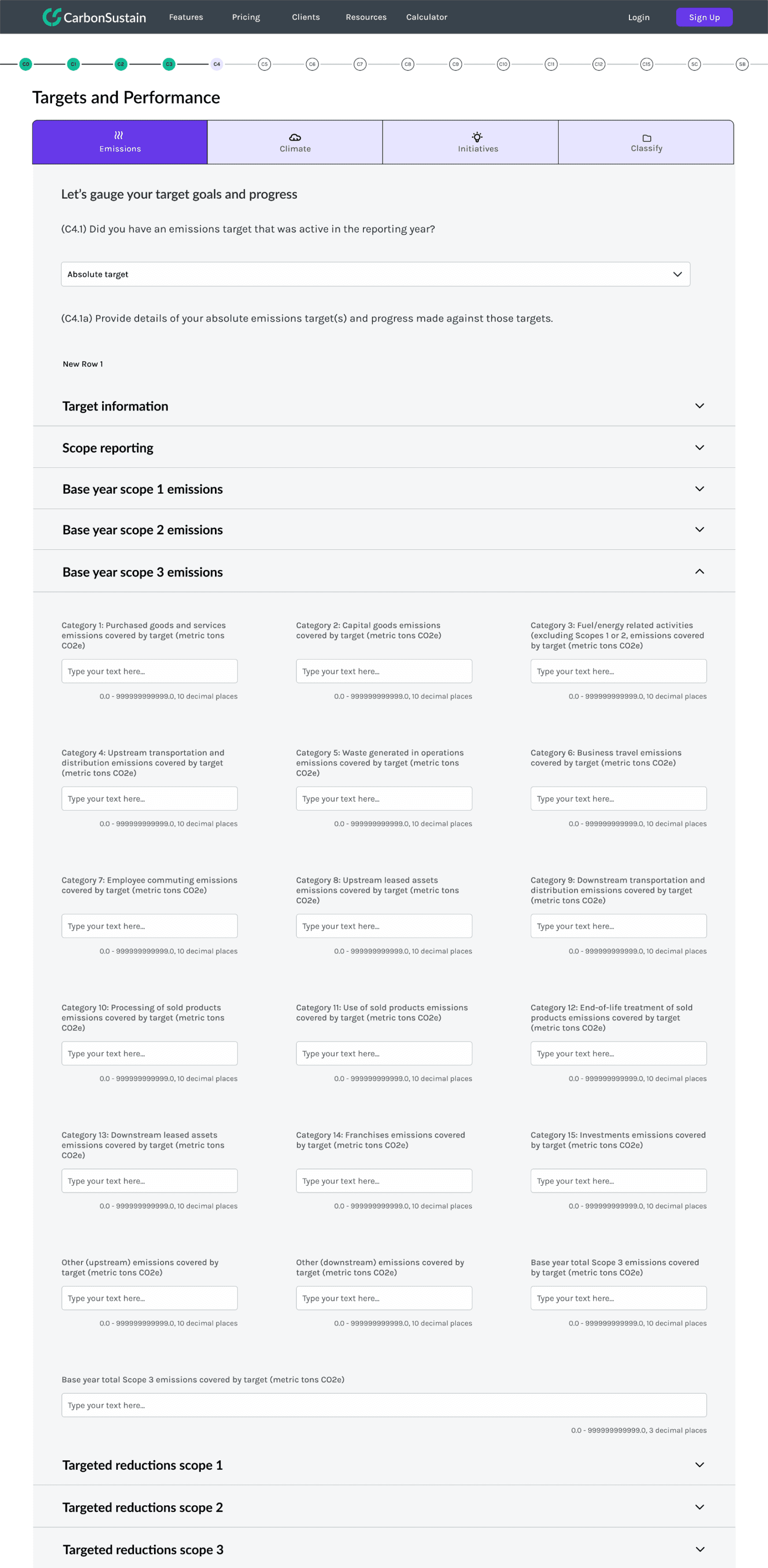
Drop down panel per scope type
Grid-like structure for input fields
Designing within technical constraints.
I contributed to the frontend development of the CDP Report using Angular, HTML, CSS, and Typescript. Angular’s component-based architecture guided my design decision in creating tabs for the subsections of each page.
final prototype
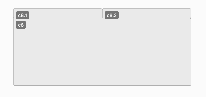
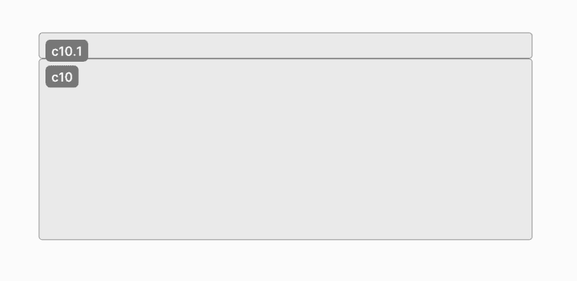
Example walkthrough.
Users navigate through the “Carbon Pricing and Credits” section, which contains three questions on: Carbon Pricing, Cancellation, and Internal Price.
additional projects
Redesigning the Landing page.
I redesigned the landing page to better showcase Carbon Sustain’s core offerings and align with the company’s branding guidelines.
Main feature displayed at the top
Company examples to increase user engagement
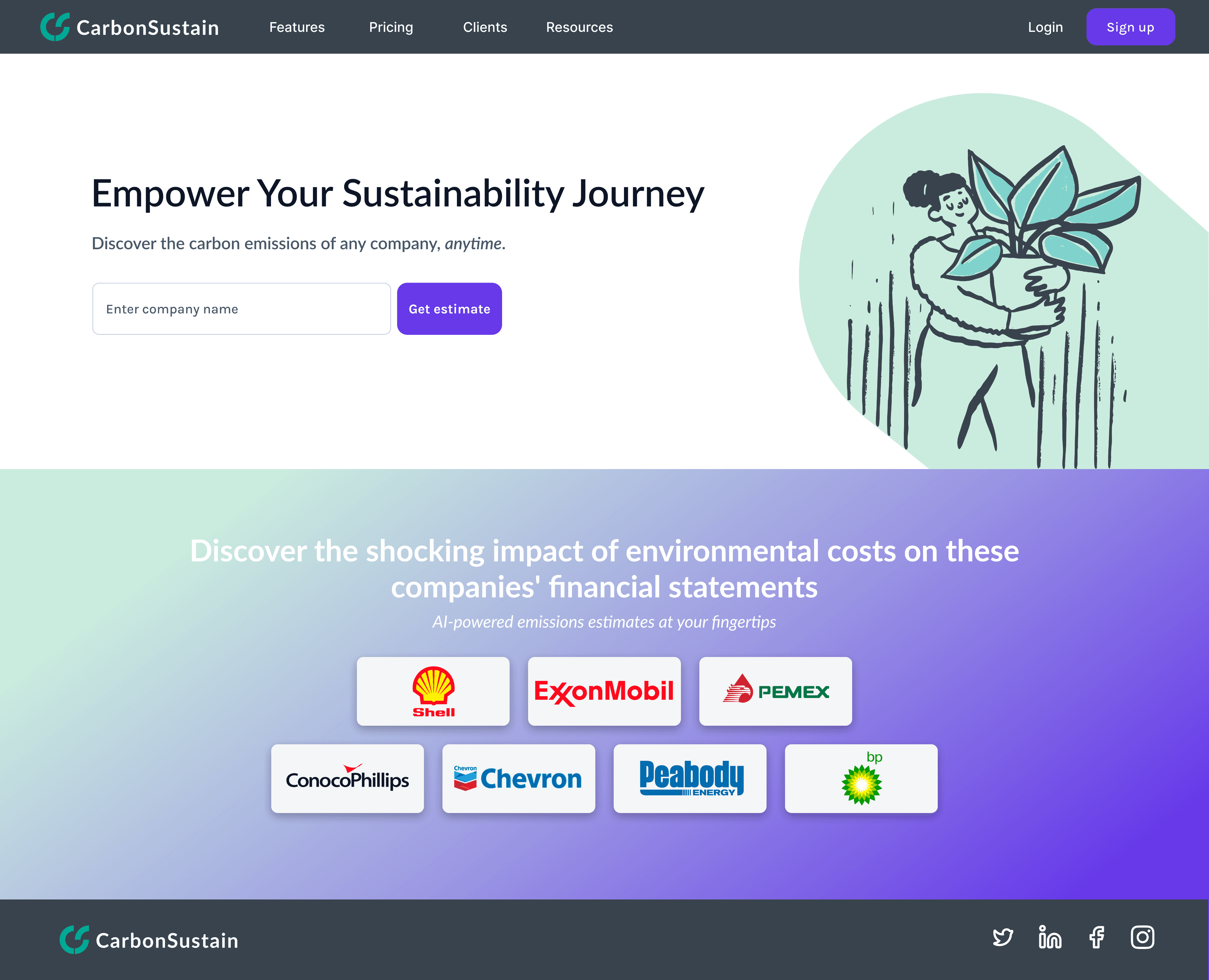
Building the Company Sustainability Score page.
I built the UI design for the ‘Empower Your Sustainability Journey’ page, which allows users to search up the sustainability scores of other companies to gain more insights.

Clear information hierarchy
Impact section
Filtering to allow for customization
Metrics breakdown for in-depth detail
Building on the AI Decarbonization Journey page.
The ‘AI Decarbonization Journey’ feature gives companies AI-generated sustainability recommendations to help increase their carbon offsetting. I worked on fine tuning features such as incorporating a color-coded system to highlight priority actions and refining the copywriting for greater accuracy.

Progress bar
Current tasks
Total impact metrics
Green completion status
Green completion status
Highlighted tags to indicate sections
Impact statement
Impact measurements
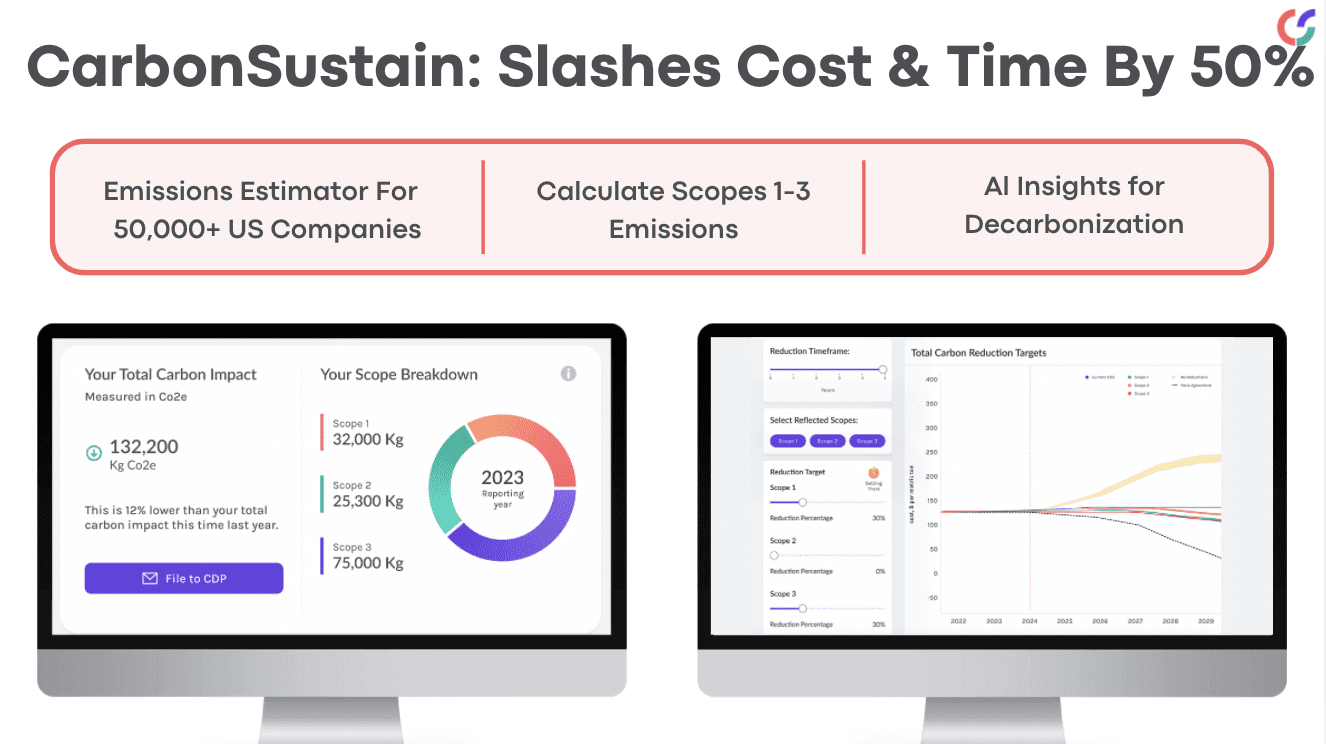
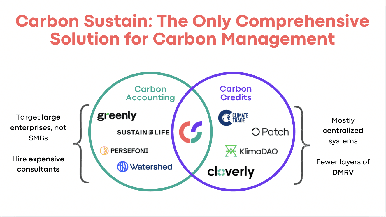
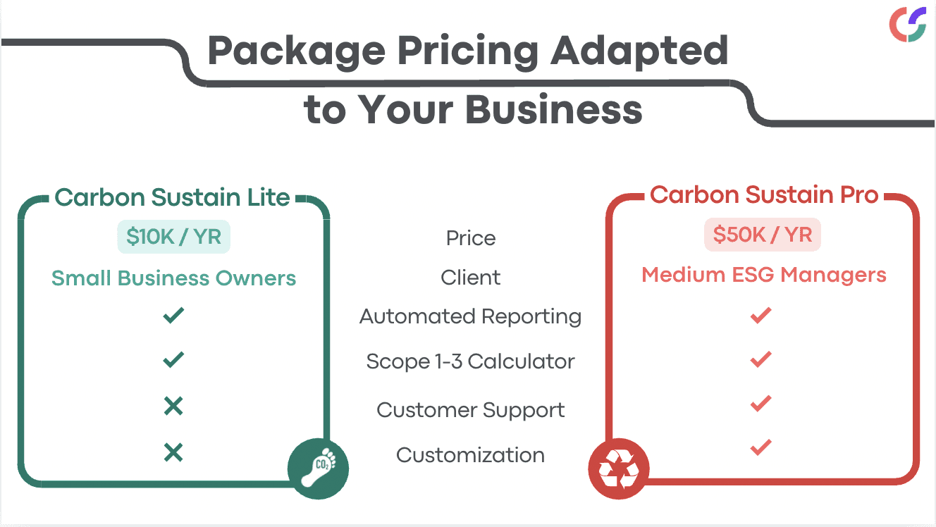
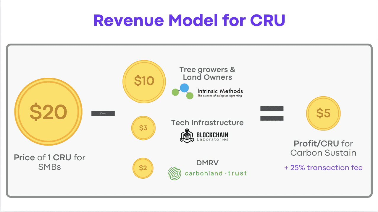
Designing pitch slide decks.
I designed a slide deck which helped Carbon Sustain place 2nd in the finals pitch at SkyDeck Pad-13. Below are a few examples.


reflection
Balancing design choices.
While consolidating questions onto a single page eliminated navigation fatigue and reduced clicks, I had to carefully balance this against potential cognitive load. I addressed this challenge by organizing inputs into a clear grid structure with logical groupings, striking a balance between efficient data entry and user comprehension.
What I would have done differently.
Although the Carbon Sustain team had already done user testing and research before I joined the project, I would have conducted more iterative testing throughout the design process to validate any earlier assumptions. Additionally, had I had the resources and means to conduct research with the businesses representatives, I would have ran A/B testing with various navigation patterns and conduct session recordings to identify any further pain points.