Designing a B2B banking management portal to streamline carbon offset management.

www.floras.io
overview
Context.
Floras is a startup sustainability platform that enables companies and consumers to invest in environmental projects and track their progress toward net-zero commitments. During my internship, I led the 0-1 design of the B2B banking portal interface, which includes conducting market research, prototyping, and handoff.
ROLE
Product Design Intern
TIMELINE
May 2024 - Sep 2024
SKILLS
Web Design, Wireframing, Prototyping, Visual Communication, Market Research
TEAM
2 Designers
Understanding the business use case.
When suppliers ship products to major corporations, they need an efficient way to offset their carbon footprint. Floras addresses this by automatically calculating the environmental impact and converting it into “Floras Points”. The corporate buyer (beneficiary) can then use these points to invest in sustainability projects of their choice, which neutralizes the shipment's carbon footprint. Once completed, the beneficiary receives a certificate (receipt) of their carbon offset contribution.
Defining the problem space.
The Floras team identified a critical gap: users had no centralized platform to manage their Floras points, instead relying on third-party sources for project selection and the Floras team for transaction management. My role focused on designing an intuitive interface to support three core user journeys:
📍
Manage Points
Users need an engaging management system that not only displays the user’s growing balance, but also provides meaningful insights into their spending patterns.
📍
Invest in Projects
Floras aims to eliminate third-party navigation by importing relevant projects directly onto their platform. They want to provide projects that align with business objectives and user needs.
📍
Measure Impact
There is currently no location for users to track their carbon reduction certificates. This makes it difficult for users to feel they’re making a tangible impact.
With these primary flows in mind, it was clear that the goal was to make environmental impact accessible for businesses.
How might we design a streamlined platform that gives businesses autonomy in achieving their carbon reduction goals?
research
Examining the financial service market.
The main features of the Floras portal follows a financial app structure where users manage their environmental credits. To inform my design decisions, I performed competitive analysis on financial platforms, including existing carbon removal companies, with a focus on: transaction and investment features, user management capabilities, visual interface elements, and best practices in financial platform design.

Bank of America

Stripe Climate
Patch.io

Scope Zero
This research led to the identification of four key product principles to guide me throughout the design process:
💡
Navigation Structure
Creating intuitive pathways through complex financial data.
Features to consider: dashboard, projects overview, transactions history, settings, profile.
💡
Engagement Elements
Encouraging active participation in sustainability initiatives.
Features to consider: Favorites tab, impact visualizers, achievement badges.
💡
Visual Hierarchy
Prioritizing critical information for quick decision-making.
Features to consider: Current balance, active projects, recent transactions, detailed analytics.
💡
Trust Indicators
Building confidence in the platform's security and reliability.
Features to consider: Verification badges, transactions confirmations, impact verifications.
design process
Designing through an iterative process.
Working closely with Floras' founders, my team adapted an iterative design process that included: weekly team-wide meetings for design reviews, regular feedback loops to align with business objectives, and mid-fidelity design presentations for stakeholder validation.
Feature 01 –
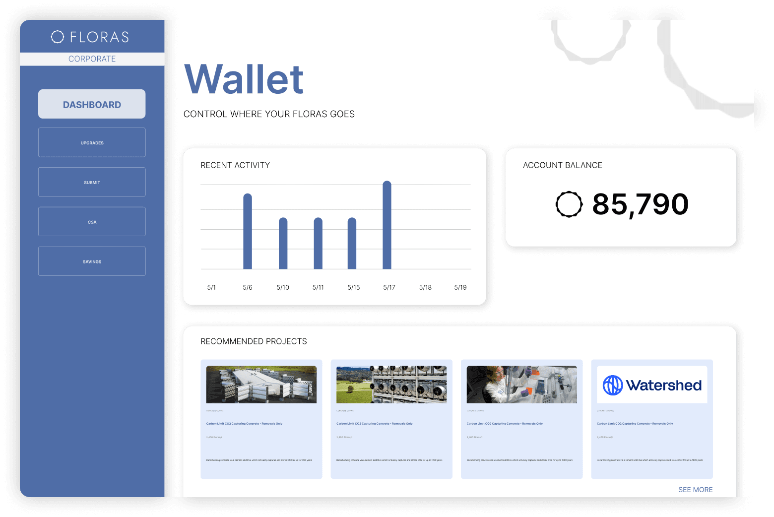
Dashboard aka Wallet
For the landing page, I created a 'Wallet' dashboard that prominently displays account balance while maintaining a personal touch. I designed the page in a bento style layout to help users engage with their Floras points.
Version 1
Version 2

Version 3
Version 3.5
Feedback.
My first few iterations were reviewed by the founders, who helped me identify some key pain points and emergent needs.
✏️
Balance Display
The balance amount should be the first thing users see. Visual hierarchy needs to be more prominent.
✏️
More CTAs
Users should have easy navigation access to other pages. The Wallet page should be designed as an overview of all features.
✏️
Space Real Estate
The content should fit onto one page without any vertical scrolling. Reduce visual overwhelm and deliver core features in a concise manner.
Final Version
A personalized wallet experience that centralizes the platform’s core features which include transaction history, spending analytics, and account management.

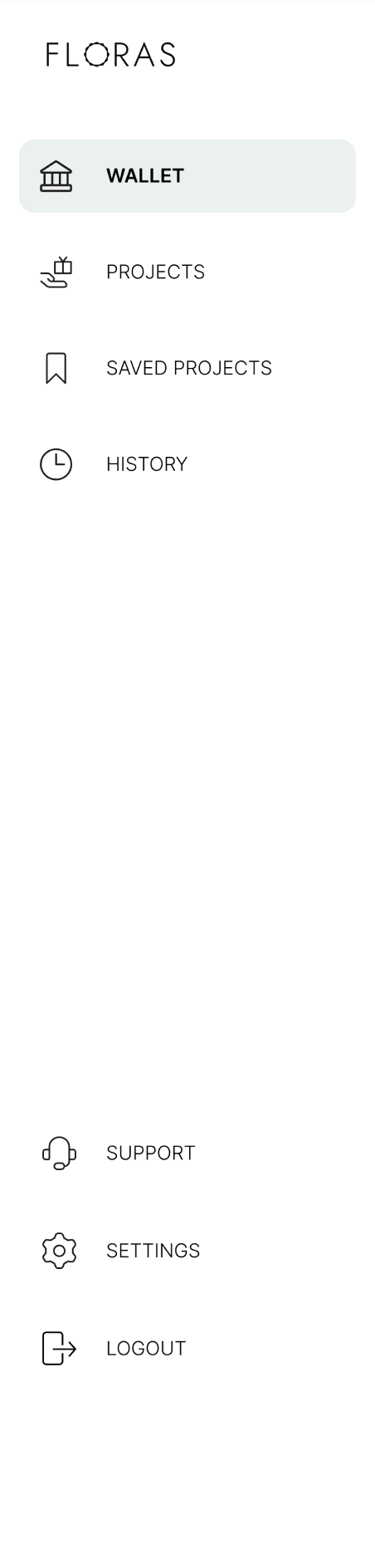
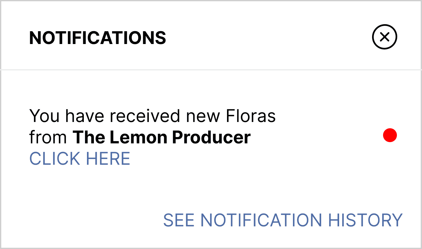
Easy access to notification history in header
Profile picture + company + role title
Quick snapshot of spending analytics
CTAs on each card for ease of navigation
Sliding menu for more space real estate
Clear display of credit balance
Personalized greeting + company card
Feature 02 –
Projects Page
For the project marketplace, compiling all the projects onto a single page wasn’t enough–structure was needed. Thus, I categorized the projects to help users efficiently find projects that matched their business goals. Each project has an individual page with additional information such as descriptions, impact metrics, and investment plans,
Initial Version

Lack of diverse projects
Ambiguous iconography
Unclear project categories
Projects condensed into a single tile with no expanded page
Final Version
A comprehensive page with clear project categories and extensive filtering options for selection of projects.


Horizontal scroll for easy navigation + space efficiency
Curated projects addressing common user needs
Projects currently invested in
Personalized project suggestions
Filter tab for project accuracy
Search navigation for specific needs

Final Version Continued
Example of a curated project portfolio tailored to specific company needs.
Back navigation to main projects page
Project cost converted to Floras points
Project type
Project description
Total Floras points per CO2 tonnes
Portfolio title
Final Version Continued
Example of specific project with a pop-up screen to guide transactions.


Balance display and FAQ inline button for easy access
Clear CTA
Interactive map feature to increase user engagement
Impact metrics for project transparency
Customizable investment tiers to match any budget
Like button to save projects for future reference
Collapsable project description for easy scan
Final Version Continued
Post transaction screen to detail impact metrics and investment summary.

Project image for visualization
CTA to increase user engagement
Summary for user satisfaction
CTAs for ease of access + next steps
Feature 03 –
History Page
For the “History” page, I designed an interface where users can track their spendings, impact metrics, and certificate management all within the same page. I ensured smooth transitions when toggling between the various features so users feel satisfied with finding the information they need.
Lack of specific carbon offset metrics; current metrics provide little information
Initial Version
The certificate portion was originally placed into the same page with account balance and settings, however it needed greater prominence and easier access for users, since they needed to keep track of their environmental impact.
Final Version
“Overall” portion of the history page that provides information on investments, earnings, and carbon offset impact of all projects.

Overall combined metrics within timeframe

Dropdown menu to set various timeframes
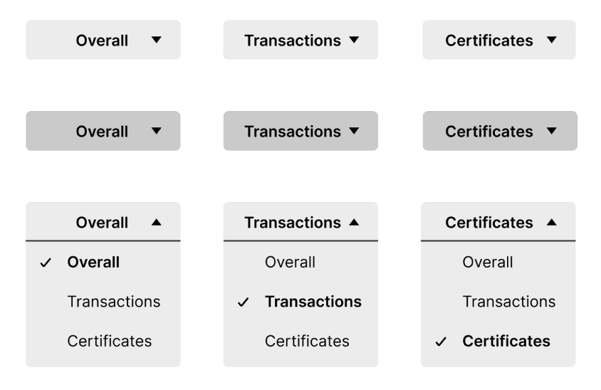
Dropdown menu to toggle between history page sections
Timeframe
Final Version Continued
“Transactions” portion of the history page where users can toggle between investments and earnings.
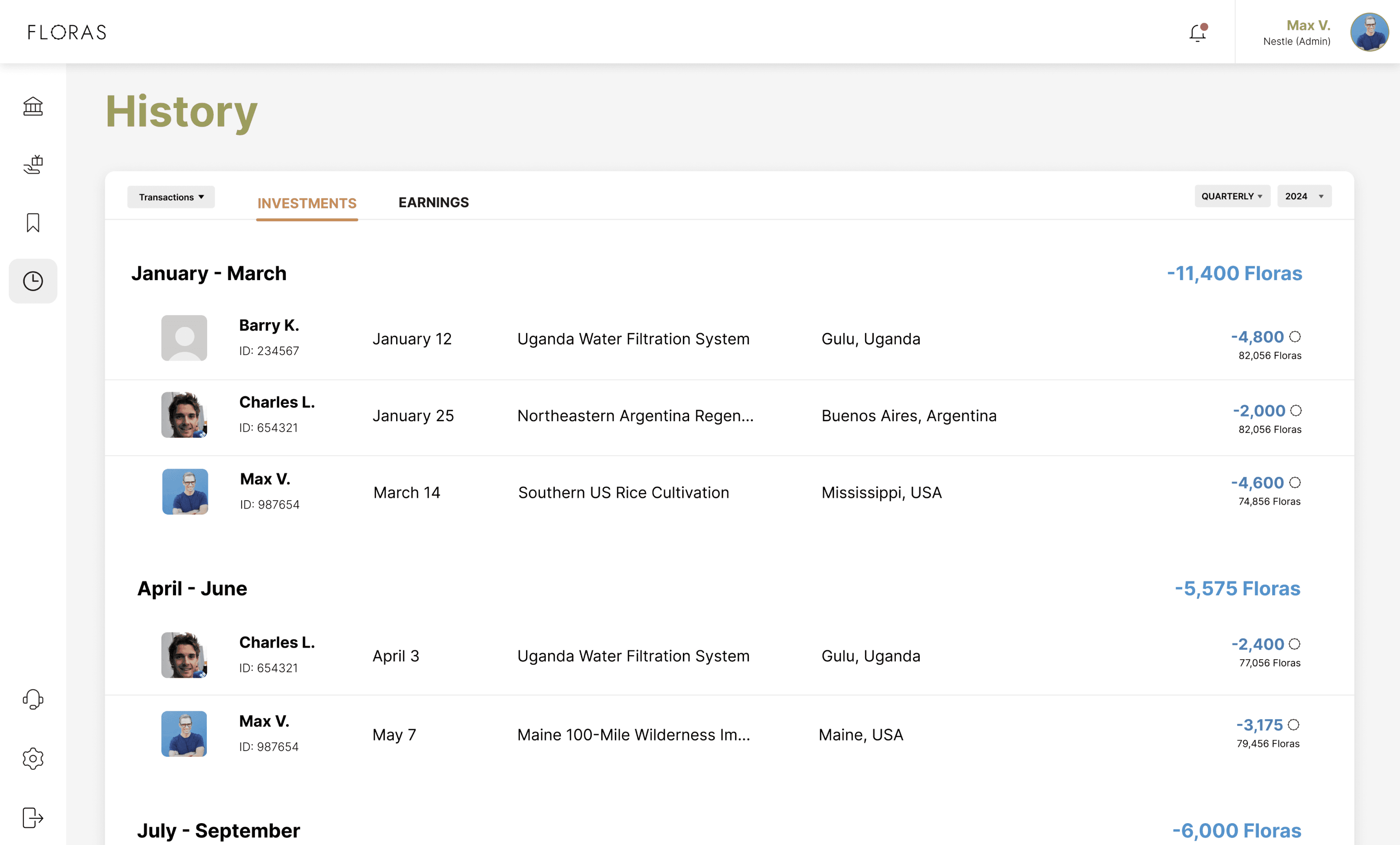
Tabs for intuitive access to different sections
Overall amount of Floras invested within timeframe
Individual transactions with total balance displayed for convenience
Final Version Continued
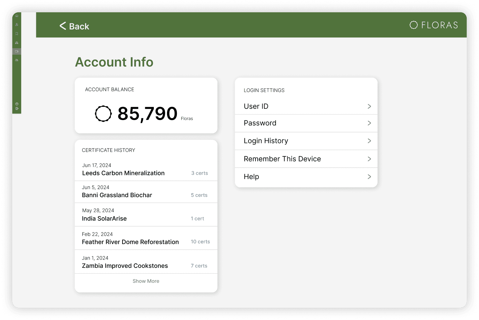
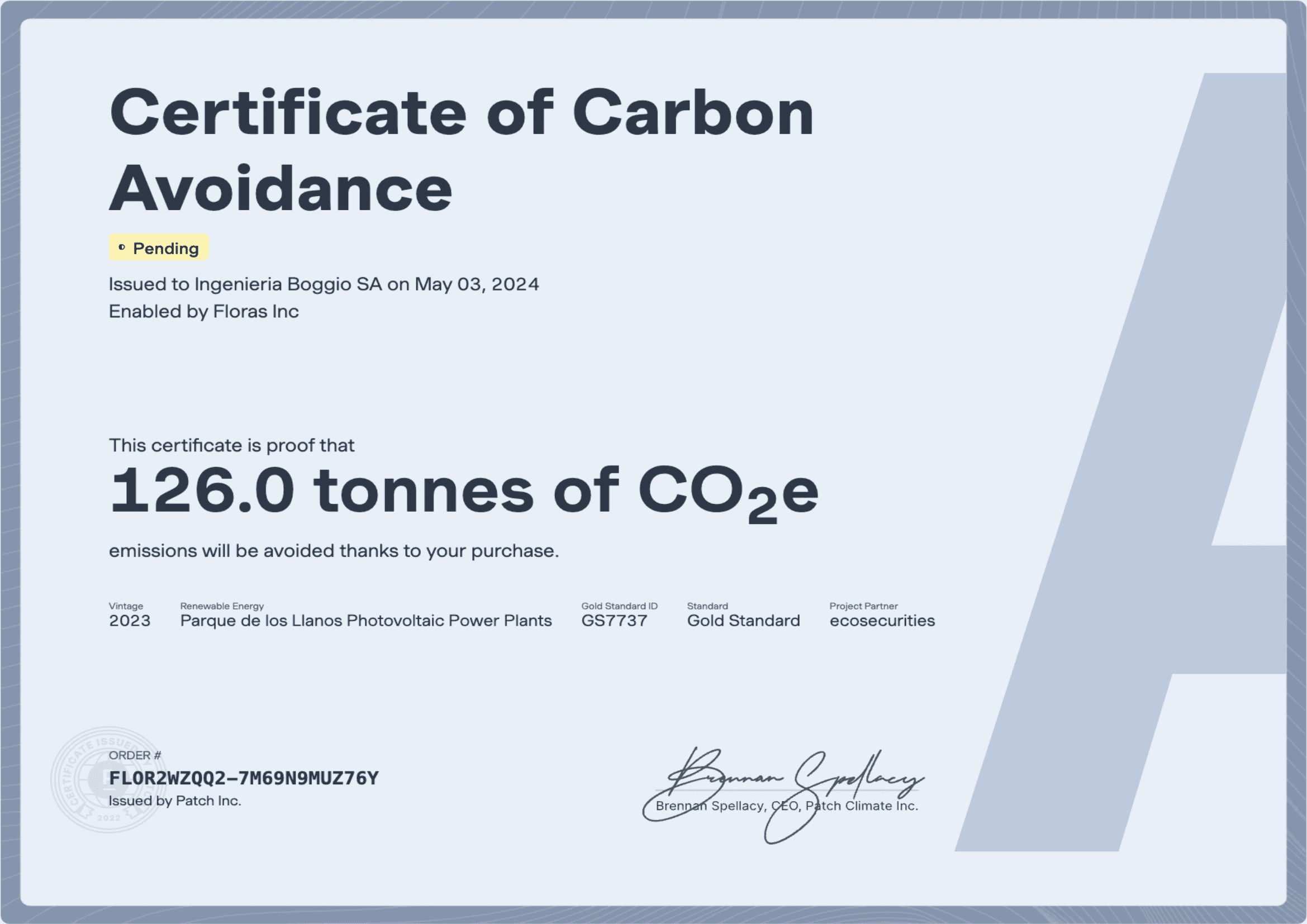
“Certificates” portion of the history page where users can access certificates and visualize environmental impact.
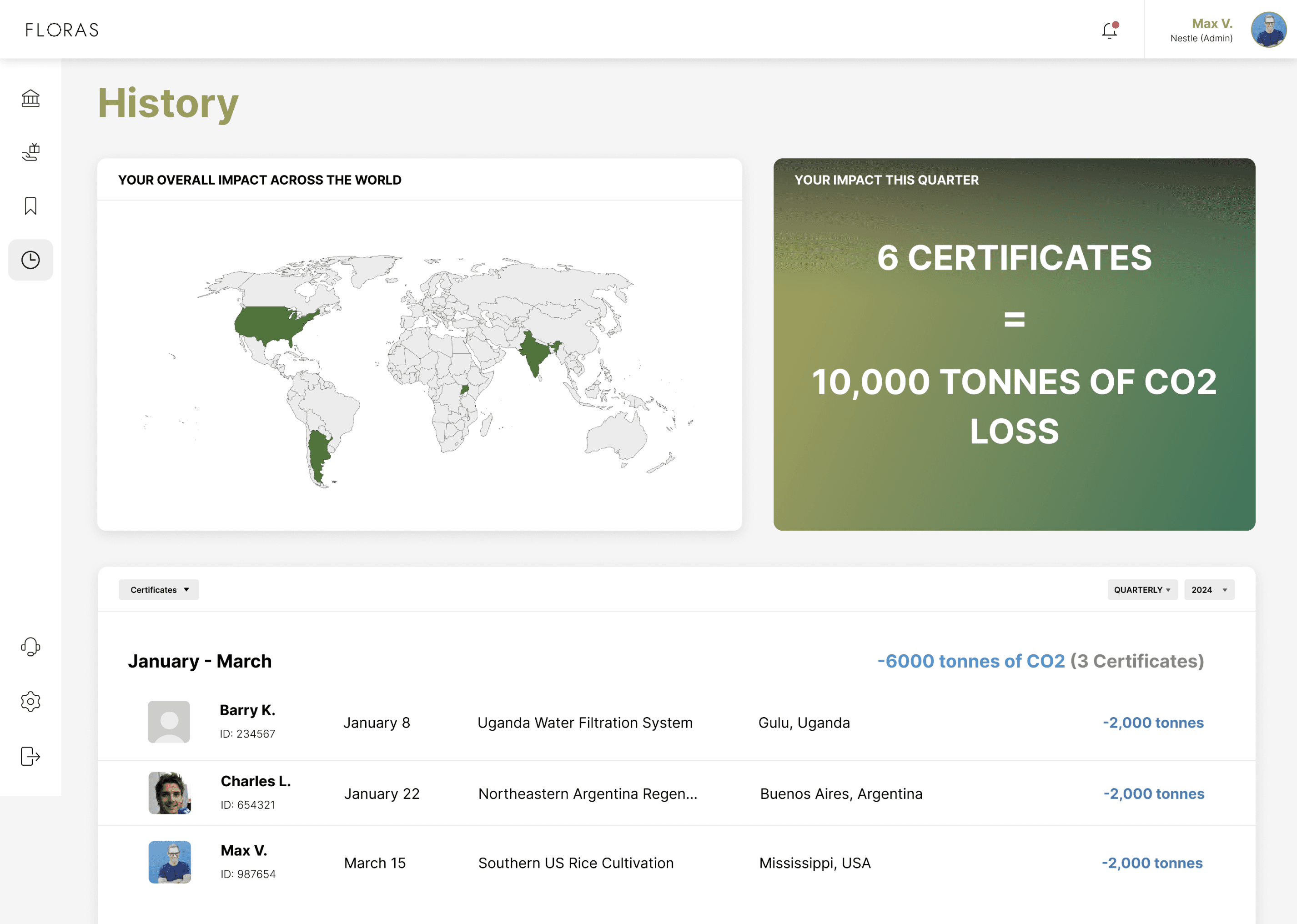
Impact visualizations to increase user engagement
Example certificate for each investment
Overall amount of carbon offset within timeframe
handoff process
Collaborating closely with the developer.
A crucial, last step of the design process was ensuring a seamless developer handoff. Working with a PHP developer using Bootstrap, I took several steps to facilitate efficient implementation:
✅
Design Adaptation
Create design components compatible with the Bootstrap framework. Document responsive behavior and interactions.
✅
Communication
Maintain clear documentation of design decisions. Regular sync-ups with development team.
✅
Technical Considerations
Ensure scalability of interface components. Create detailed specifications for animations and interactions.
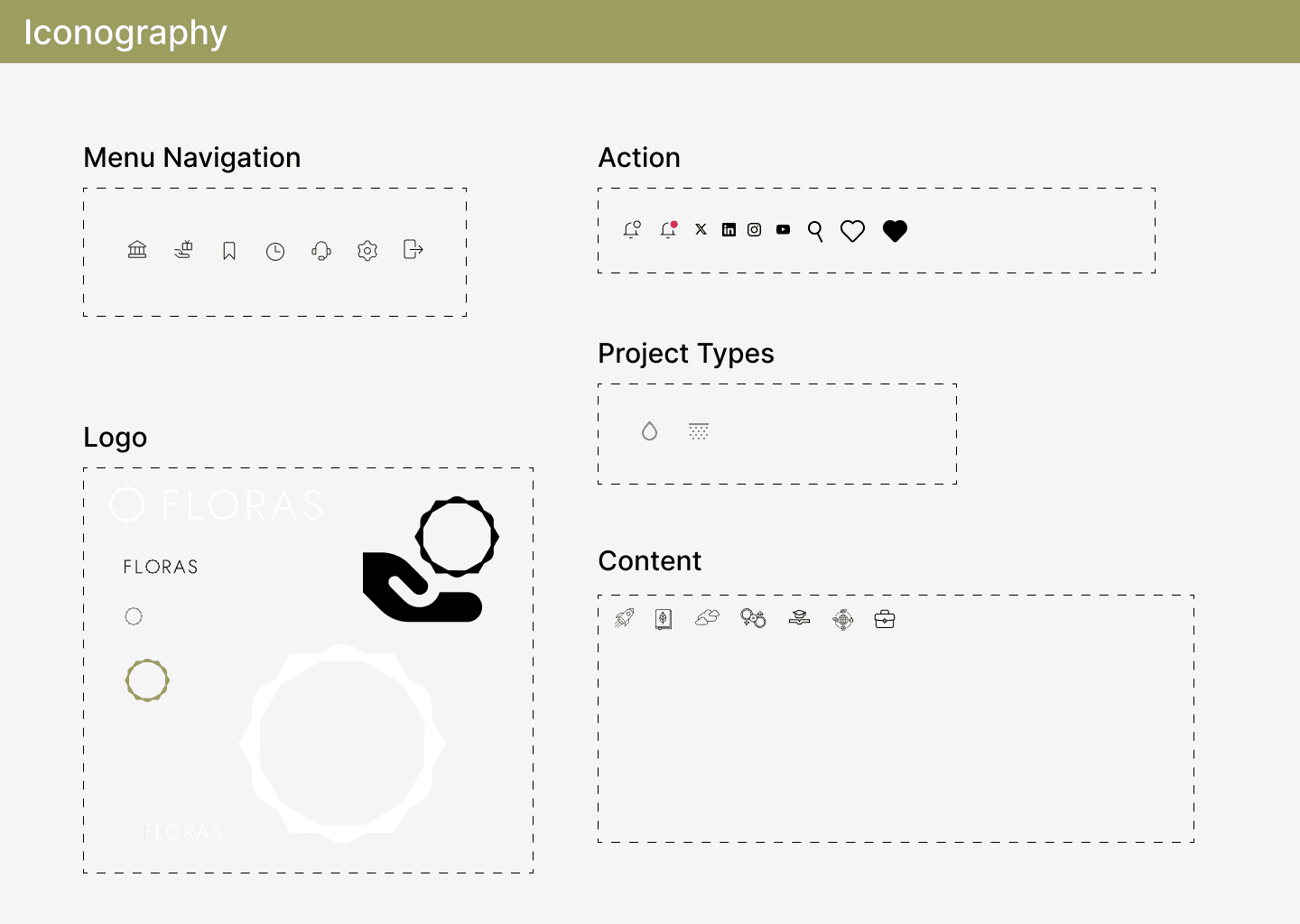
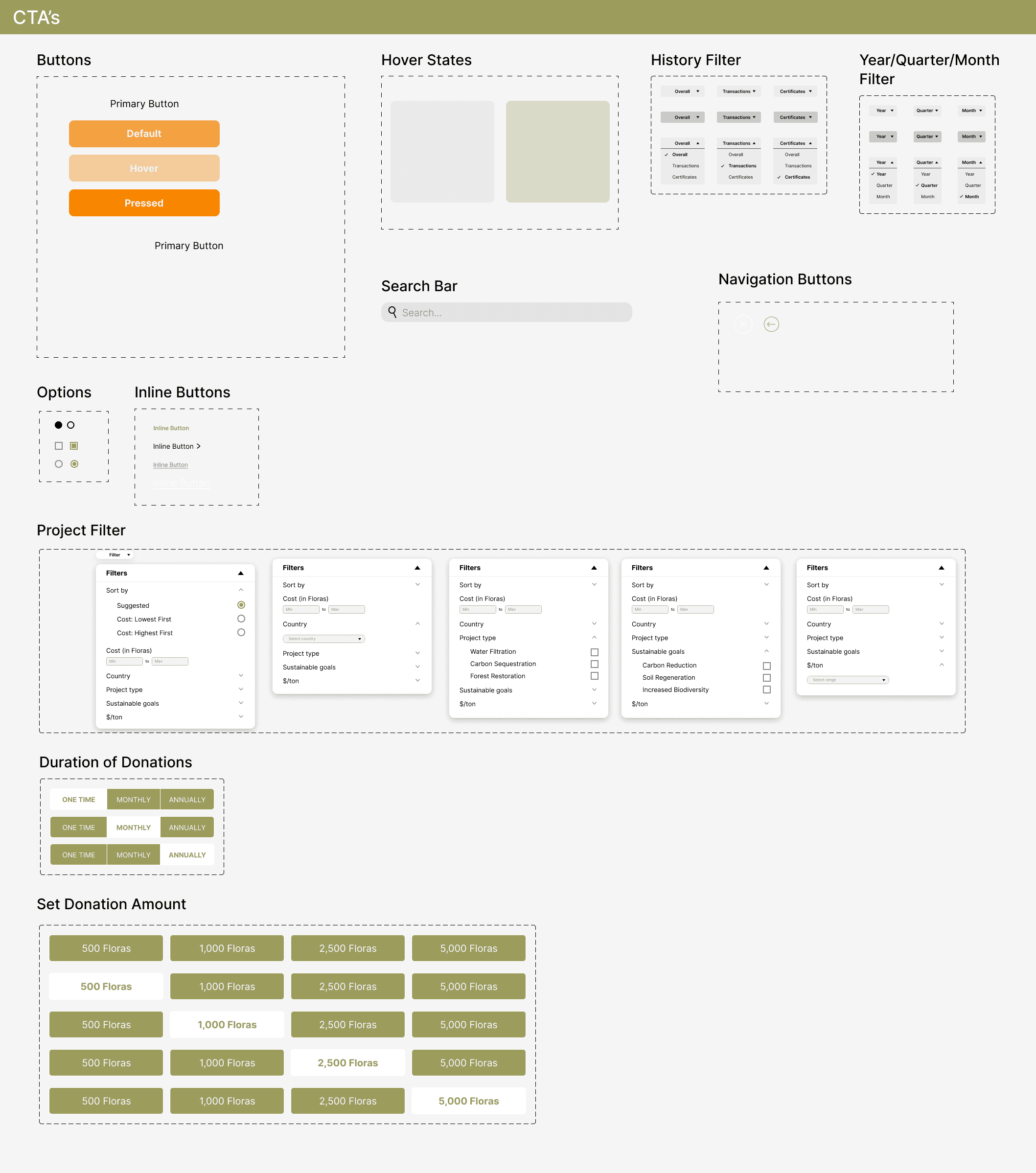
Design System + Style Guide


final prototypes
Sign In Flow.
A quick and simple log in/sign up flow for users, bringing them to their personalized Wallet portal to manage their investments.


Project Investment Flow.
Users can browse through the projects and filter for specific requirements. Each project expands for more details and users can customize investment plans according to their budgets.

Transactions + Impact Tracking Flow.
The History page allows users to get an overview of their investments, earnings, and certificates with the option to display their history on a monthly, quarterly, or yearly basis.

reflection
Growth through ground-up design.
This was my first ever design internship, where I also got to work in a startup setting. While designing an end-to-end project, I learned to think quickly on my feet, budgeting my time efficiently and asking the right questions during meetings in order to design effective solutions. Because I was helping to build this product from the ground up, it was imperative that I accepted tons of constructive feedback where I kept an open feedback loop. Working under a rapid iteration process allowed me to develop my design skillset broadly!
Aligning design decisions with stakeholder expectations.
Working closely with Floras' founders gave me valuable business perspective for design decisions. When creating a prototype for potential clients like Nestlé, I put myself in their representatives' shoes–this led to features like design portfolios, clear categories, and personalized landing page elements. Additionally, collaborating with developers taught me to balance design innovation with technical feasibility, resulting in a comprehensive style guide that streamlined the handoff process.
What I would have done differently.
I would have first started by building out a comprehensive design system before diving into designing. I found that I spent a good chunk of my time on re-iterating CTA buttons and card components, which prolonged my final design process when figuring out information hierarchy and placement. I learned that having solid building blocks can help in streamlining the building process while creating products that are both malleable and scalable.